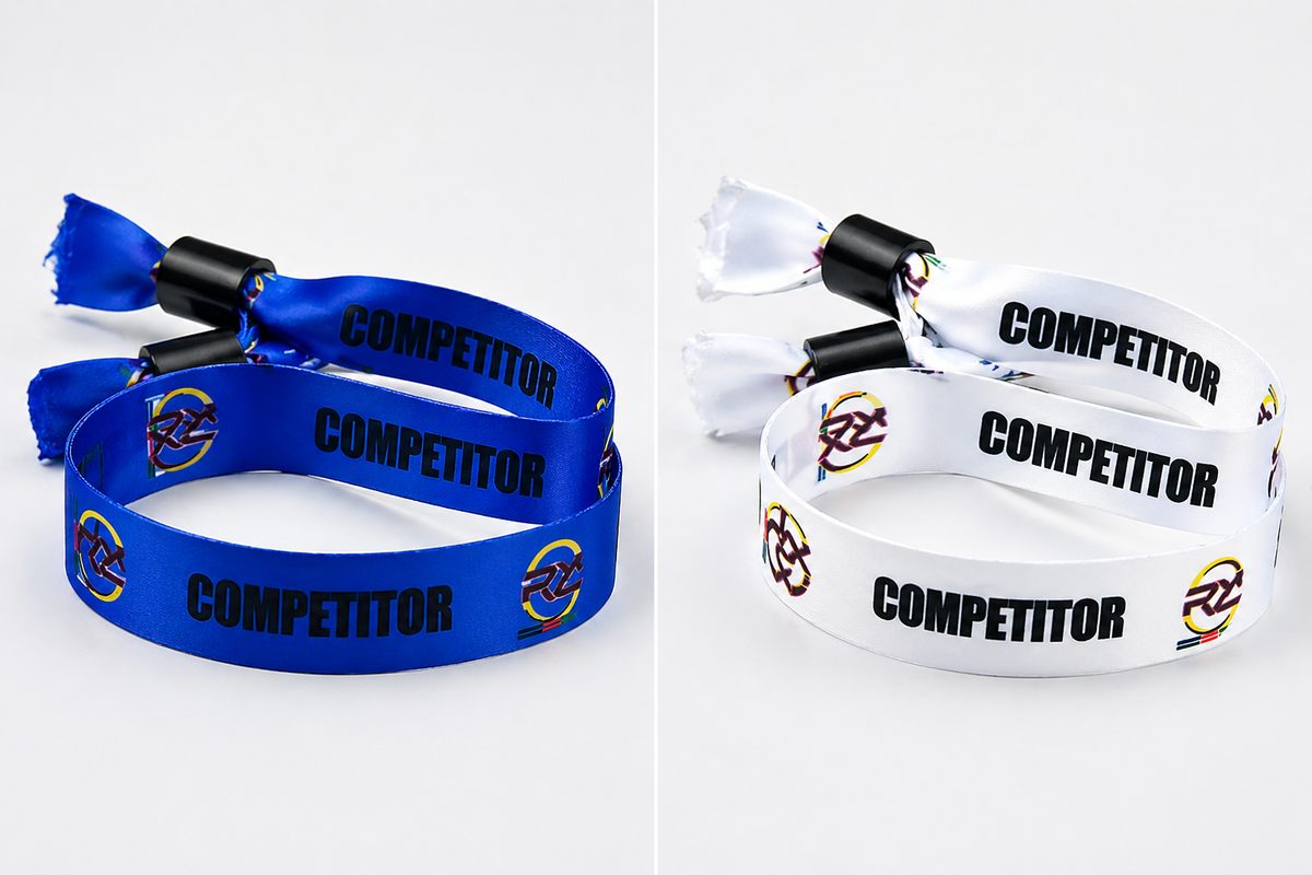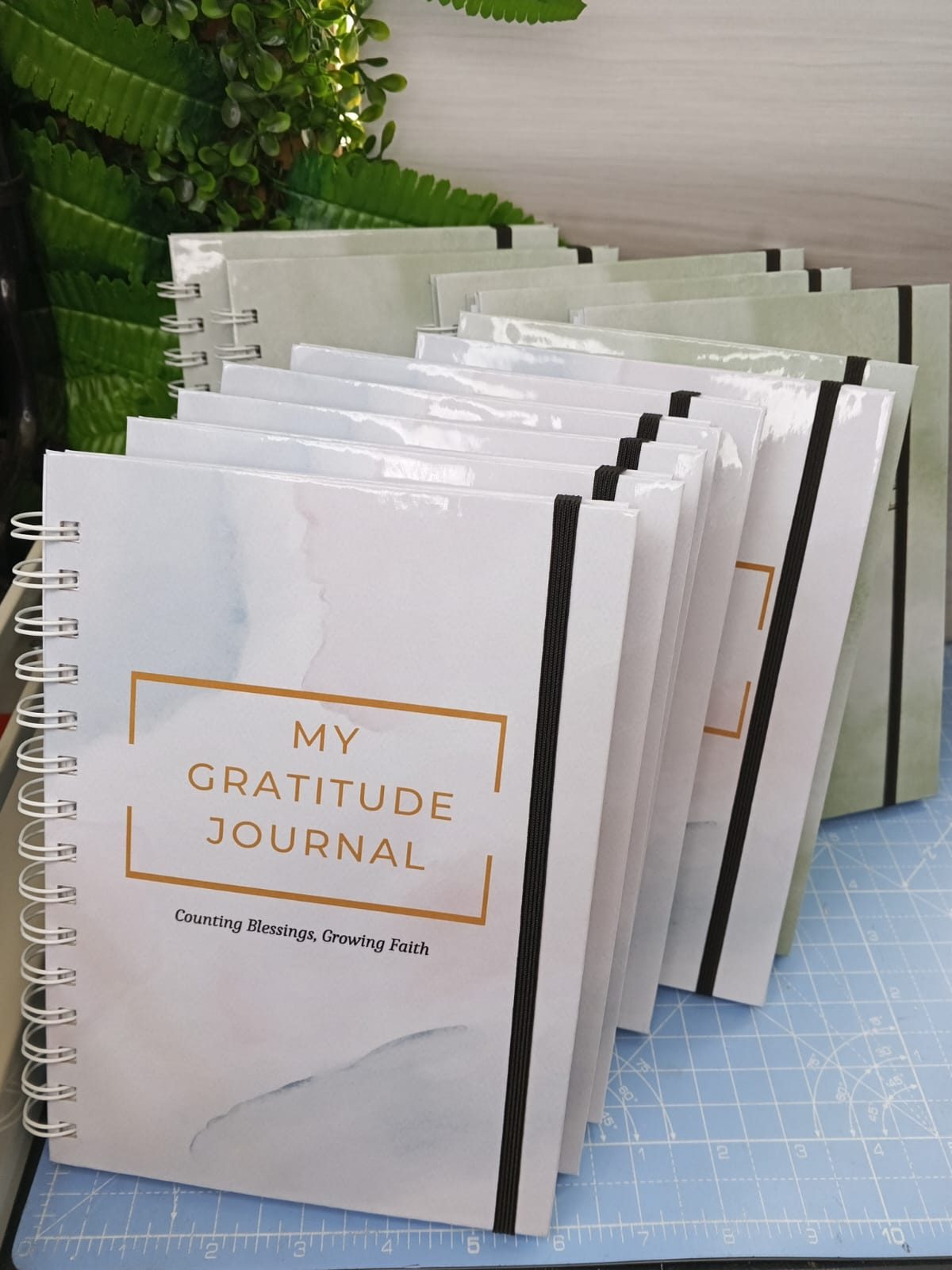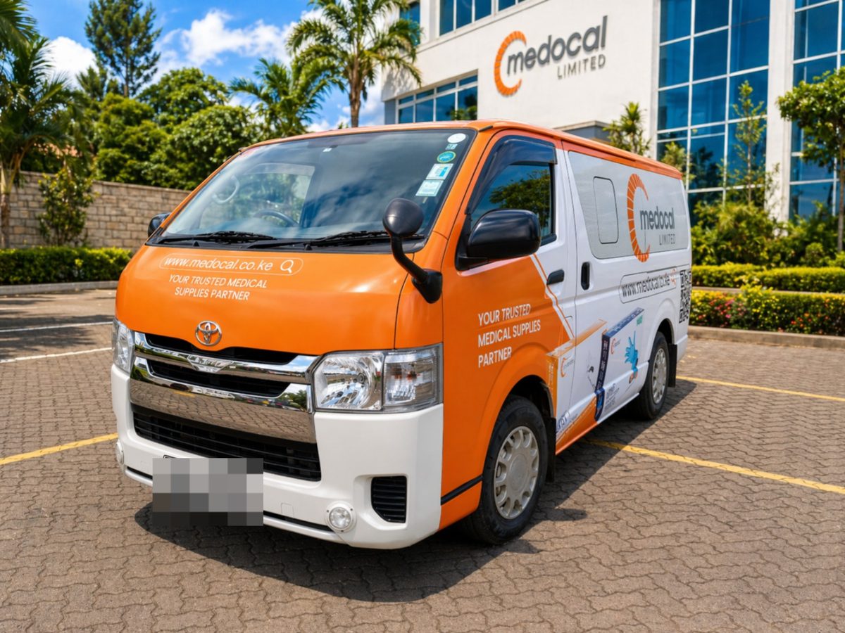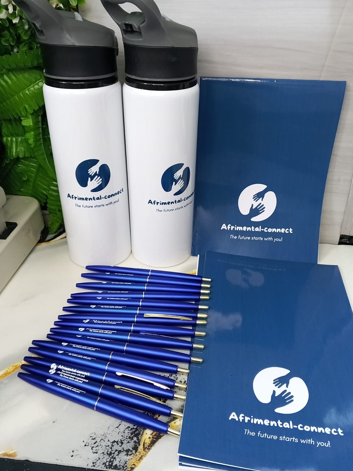
Most reprints are not printing mistakes — they are briefing gaps. Here is exactly what to send us, and what we will ask for if you do not.
A job that comes back for a reprint has almost never failed on the press. It failed at the brief. Somebody sent a logo pulled off a website, nobody agreed which blue was the blue, and the approval came from a person who was not going to be the one unhappy with it. All three are avoidable in about ten minutes.
Send vector artwork, not a screenshot
A logo lifted from a website or a PowerPoint deck is usually a few hundred pixels wide. That is fine on a screen and hopeless on a two-metre banner, where it turns into soft, stepped edges. What we want is the original vector file — .ai, .eps, .pdf or .svg — because vectors scale to any size without losing an edge.
If the vector is genuinely lost, say so early. We redraw logos all the time and it is a small job when there is time for it. It is a painful job the afternoon before an event.
Name your colours, do not describe them
“Our navy” means nothing to a press. Pantone references mean everything. Give us the Pantone for each brand colour and tell us which ones are non-negotiable, because different processes reach colour differently: screen printing on cotton, embroidery thread, UV ink on vinyl and a ceramic mug transfer will never be a perfect match for one another. Knowing which colour is the sacred one tells us where to spend the accuracy.
Pantone codes for every brand colour, plus CMYK and RGB if you have them
Which colour must match exactly, and which can shift slightly
Whether the logo has an approved single-colour or reversed version
Minimum clear space and minimum size rules, if your brand book sets them
Say where it is going, not just what it is
“Fifty t-shirts” and “fifty t-shirts for a sales team working outdoors in Naivasha in January” are different jobs. The second tells us to steer you toward a breathable fabric, a print method that survives sweat and sun, and colours that hide dust. Context changes our recommendation more than quantity does.
The same applies to print. A label that will sit in a fridge needs a different adhesive from one going on a dry carton. A banner that will live outdoors for six months is not the same banner as the one used for a single afternoon.
Decide who signs off before you start
Name one approver. Not a committee, not “the team”. One person whose yes is final, who is reachable during the production window, and who understands that changes after sign-off mean new plates, new screens or a new setup. When three people each hold a partial veto, artwork rounds multiply and the delivery date quietly moves.
Ask for a proof, and look at it properly
We proof every job. A digital proof catches spelling, layout and placement. A physical sample catches everything else: how the thread reads on that fabric, how glossy the label really looks, whether the mug print sits where a right-handed person's thumb goes. On bulk runs, a physical sample is worth the extra day almost every time.
Read the proof out loud, backwards, with someone else in the room. Phone numbers and URLs are where errors hide.
Build in a buffer you do not mention to anyone
Tell us your real deadline, then privately hold two or three days back from it. Bulk apparel, embroidery digitising and anything needing installation are the steps that stretch. A buffer is the difference between a calm reprint of one wrong item and a frantic one.
Send us the vector, the Pantones, the context, the approver and the date. We will take it from there — and if anything in that list is missing, we will ask, because it is cheaper to ask now.
Shop Corporate Branding
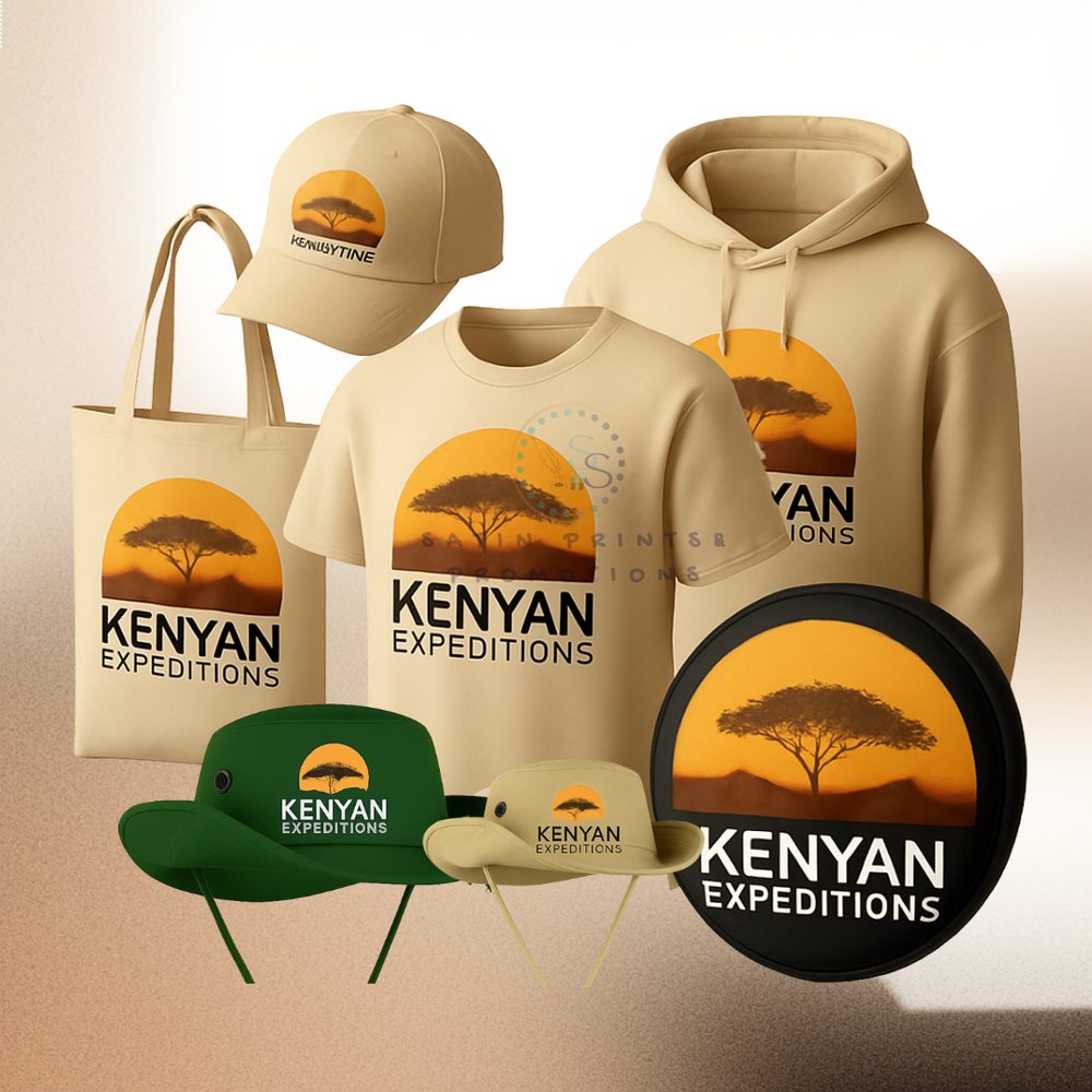
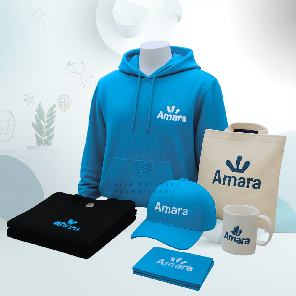
One logo, applied across everything your team touches.